
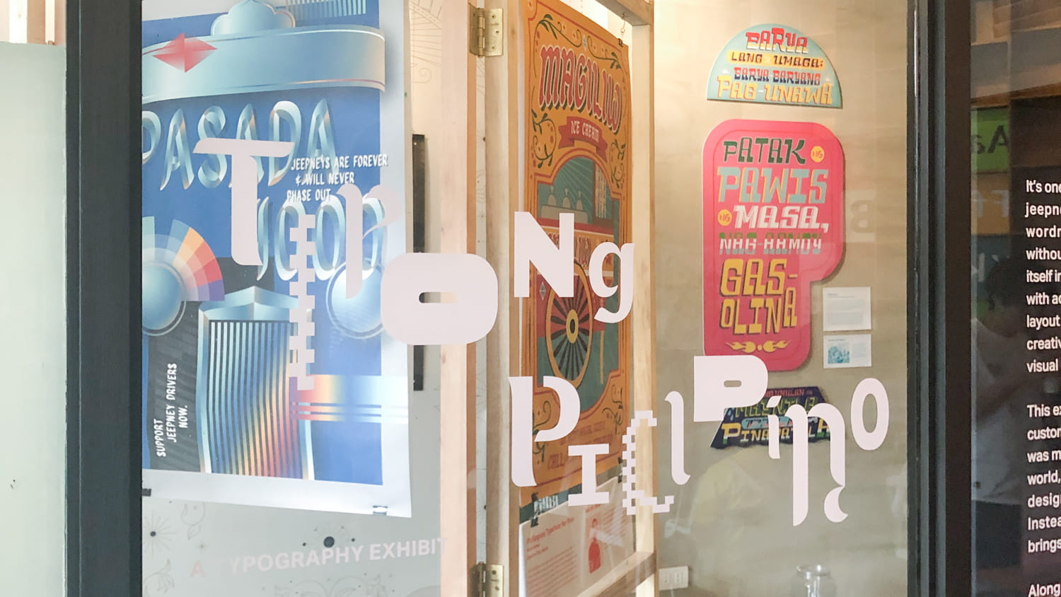
Our work at the Tipong Pilipino exhibit in Escolta Exchange. The exhibit ran from November 16 to 30, 2019, as a part of the Escolta Block Festival.
Don’t let anyone tell you otherwise; we have a transport crisis on our hands. The commuters know best. It’s not just the slow-moving cars or the build-up on this and that avenue, it’s also the time spent queueing up, falling in line, looking forward to your turn, all as thousands of fellow commuters fit themselves into the smallest of areas. If this image holds true, then this is truly what our city looks and feels like—congestion has become a national preoccupation.
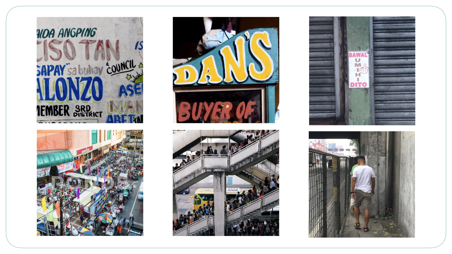
We saw parallels in the way we live in Metro Manila and the typography we see on our streets: the busyness, the spontaneity, the adjustment to awkward spaces, and the penchant for decoration.
Our waiting areas are liminal spaces where we are caught between here and there, between being stuck and finally moving, between this is it and this could still be better. Contrary to what anyone else might think, waiting is not a passive act. Beneath the image of someone’s arms crossed and the endless scrolling on a smartphone, people are waiting with purpose. To wait is to burn with hope that there’s a better situation for all of us. Abangan is not merely ábángan or waiting shed; it is also abangán, a declaration, a call, a warning: just you wait and see.
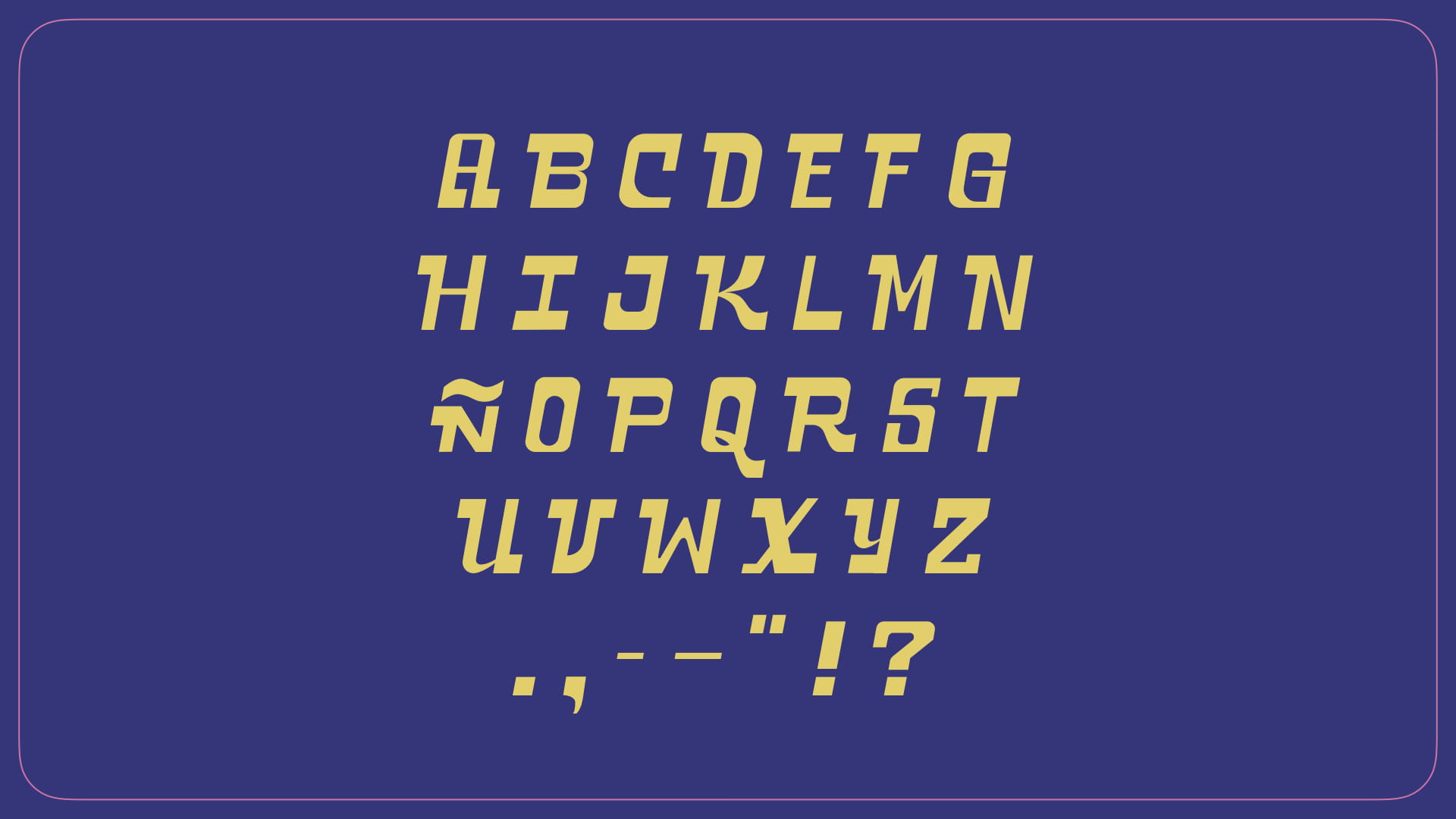
Our typeface, Abangan, is a brash, all-caps semi-serif inspired by our metropolis’ chaotic streets and public spaces—sometimes smooth, sometimes sharp, but always in motion and rarely quiet. Italicized thick and thin strokes make our letterforms dynamic. Small embellishments, such as the decorative sa and ng, insert themselves between words. The typeface’s various decorative forms—whether it’s a solid drop shadow in a bright hue or letters halved crosswise into different candy-colored shades—are inspired by designs commonly seen on public utility vehicles, and add a distinct Filipino feel.
Just as it is in our city, our typeface regards rules as mere suggestions. We relied more on instinct rather than typographic conventions in the process of designing this typeface. Although we referred to an axonometric grid as a base, we wanted to emulate the feel of traditional hand-painting, where each letter is unique with its own quirks and imperfections, shaped by human hands. Every character can be freely scaled or squished to adjust to the available space, making room for more letters and always encouraging flair.
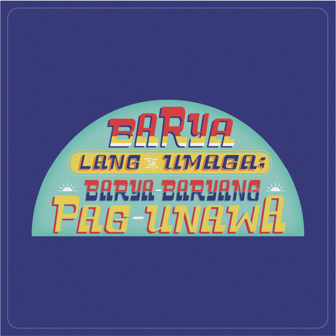
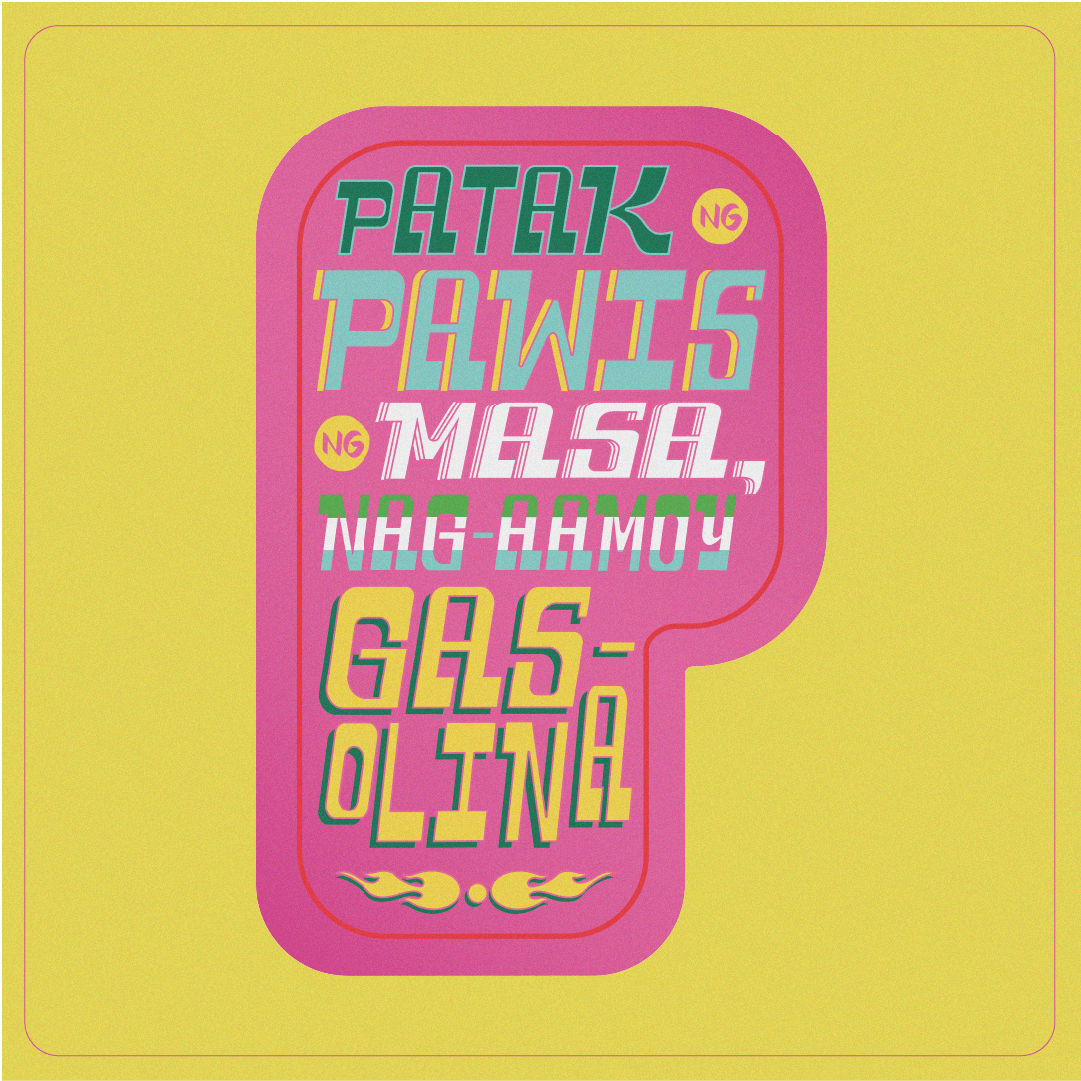
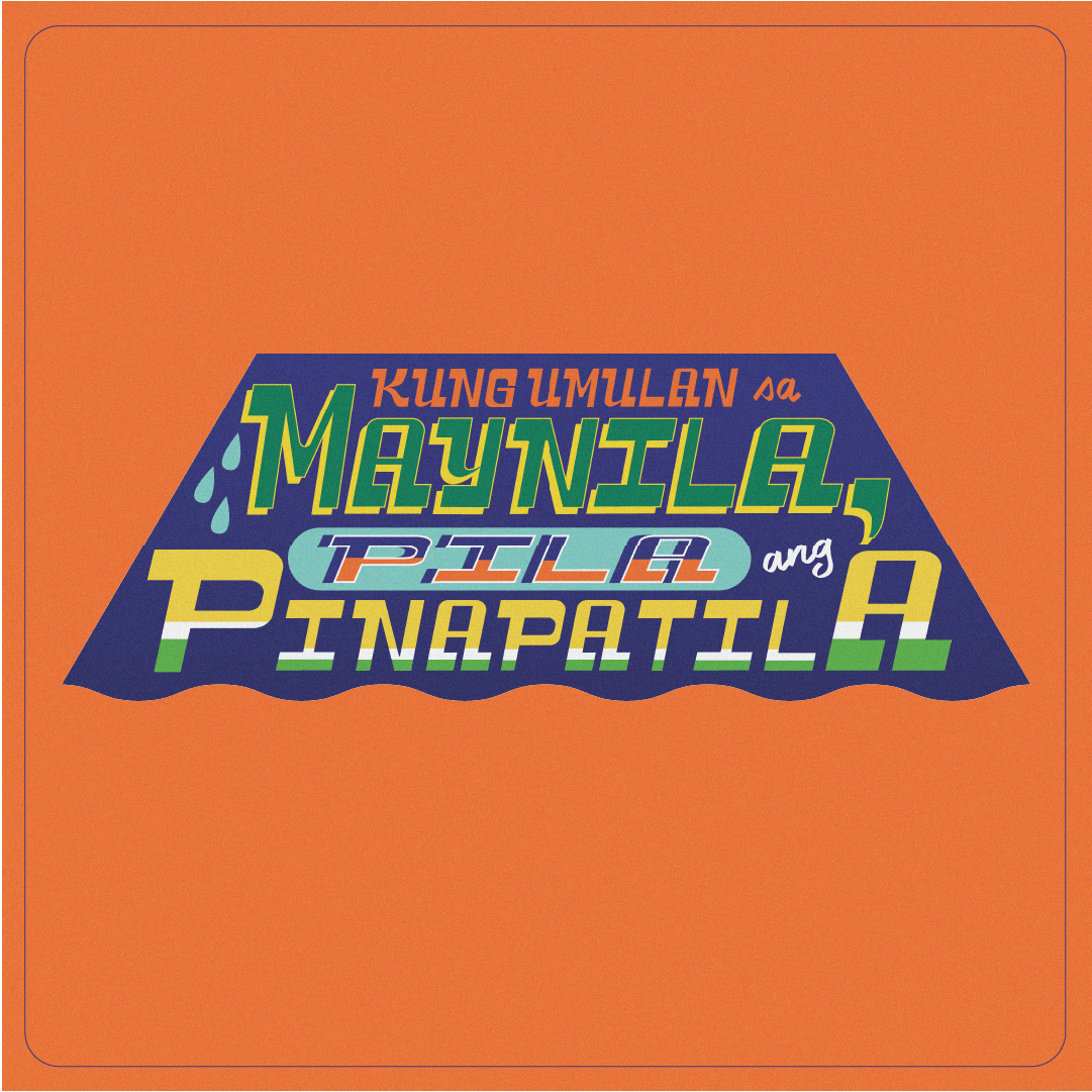
Abangan is particularly useful for applications that require an urgency of message paired with the unpredictability of play. Yes, we remain loud, but in different ways each time. It's a testament to the kind of radical and counter-intuitive approaches that we need to keep dreaming about and moving towards, especially in these modern times where solutions are rarely linear and literal. This patience-cum-eagerness is what the type tries to embody: We just can't wait, and conversely, we can't just wait.
